The Mayfield Clinic

Client
services
sector
Year
The Mayfield Clinic brings together a multidisciplinary team across private healthcare, surgery, women's health and aesthetic medicine.
The private healthcare and aesthetics sector is visually crowded, often divided between sterile clinical branding and overtly cosmetic, lifestyle-led identities. For The Mayfield Clinic, neither direction felt appropriate. The challenge was to create an identity that communicated medical credibility and premium care while remaining warm, discreet and distinctly human.
The Mayfield Clinic brings together a multidisciplinary team across private healthcare, surgery, women's health and aesthetic medicine. The identity needed to reflect this breadth while positioning aesthetics as part of a wider approach to health, wellbeing and patient care. It also needed to feel appropriate for the clinic's new, luxurious setting without becoming overly exclusive or decorative.
The outcome needed to feel measured, intelligent and quietly confident, establishing a premium presence without relying on the visual conventions typically associated with either medical or cosmetic brands.


A refined identity built around precision, confidence and restraint
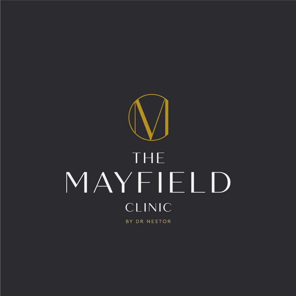




- Bespoke monogram creating a distinctive and ownable brand mark
- Interlocking letterforms combining craft, precision and sophistication
- Premium visual language designed to complement the clinic's luxury setting
- Refined typography with considered spacing and hierarchy
- Balanced positioning bridging medical expertise and aesthetic medicine
- Minimal visual system allowing the brand to communicate confidence without unnecessary decoration
- Multidisciplinary identity designed to support the clinic's broader healthcare and wellbeing offering