Palacerigg Community Trust
Client
services
sector
Year
Giving a community-led revival a visual identity
In 2018, I volunteered as a designer to support Palacerigg Community Farm’s campaign to revive the much-loved animal sanctuary within Palacerigg Country Park in Cumbernauld. The challenge was to create an identity that felt rooted in the landscape and agriculture, while giving the campaign a recognisable and adaptable presence across the local community.
Palacerigg’s ambitions centred around bringing animals, agriculture and people back into the park, while continuing to build support and raise vital funds. The identity needed to communicate that purpose clearly and feel approachable, distinctive and connected to the natural environment. It also needed to work across a wide range of applications, from large-scale signage and fundraising materials to smaller digital and promotional assets.


A flexible identity built around place, nature and community

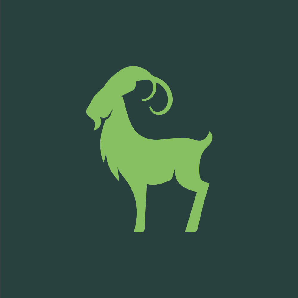
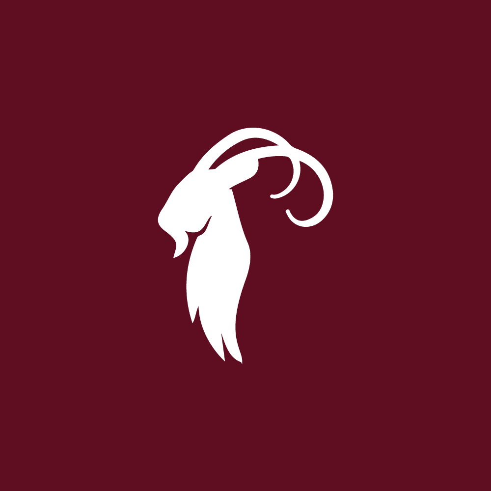


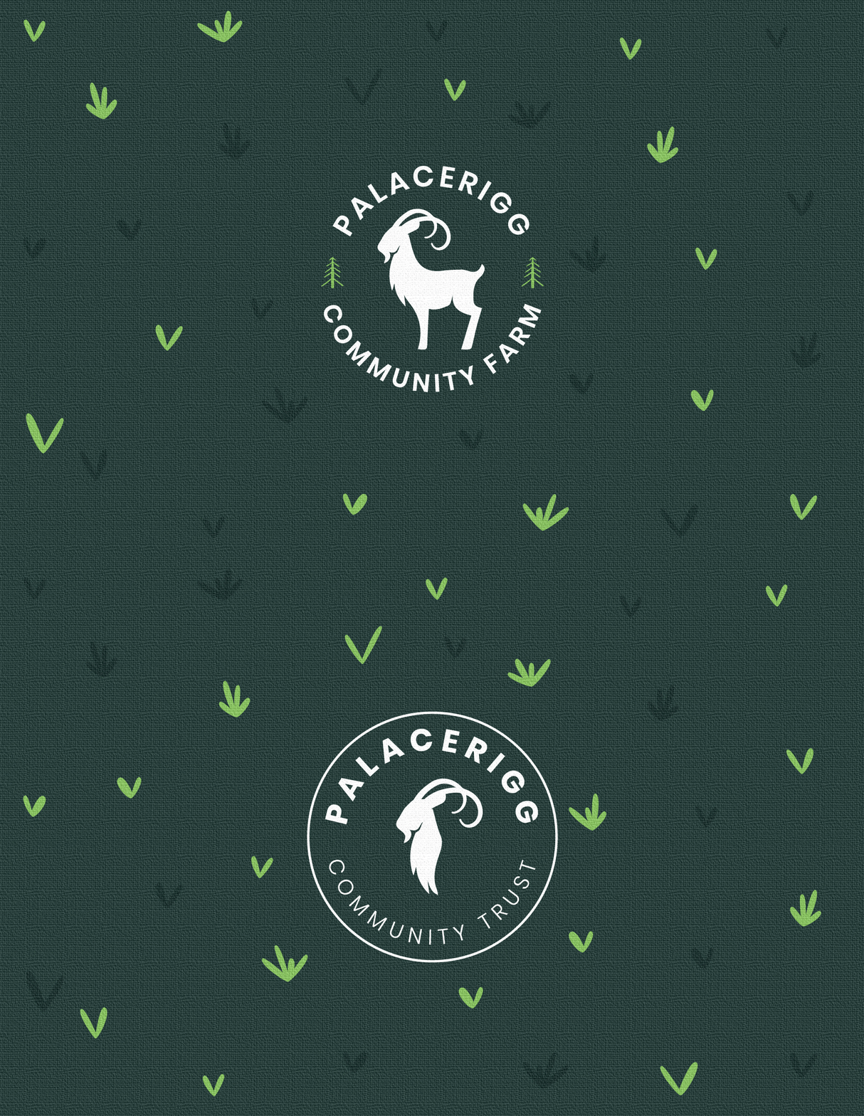
- Flexible logo system with horizontal, circular and icon variations
- Distinctive goat mark connecting the identity directly to the farm and its animals
- Nature-led colour palette inspired by Palacerigg’s landscape and agricultural setting
- Complementary Trust identity with a contrasting burgundy colour palette
- Designed for multiple applications, from signage and fundraising to promotional materials
- Long-term impact, with the identity continuing to appear across Palacerigg today
- Community-focused branding supporting the wider ambition to bring animals, agriculture and people back into the park